
The space is a smooth blend of whiskey warmth and Singapore cool.
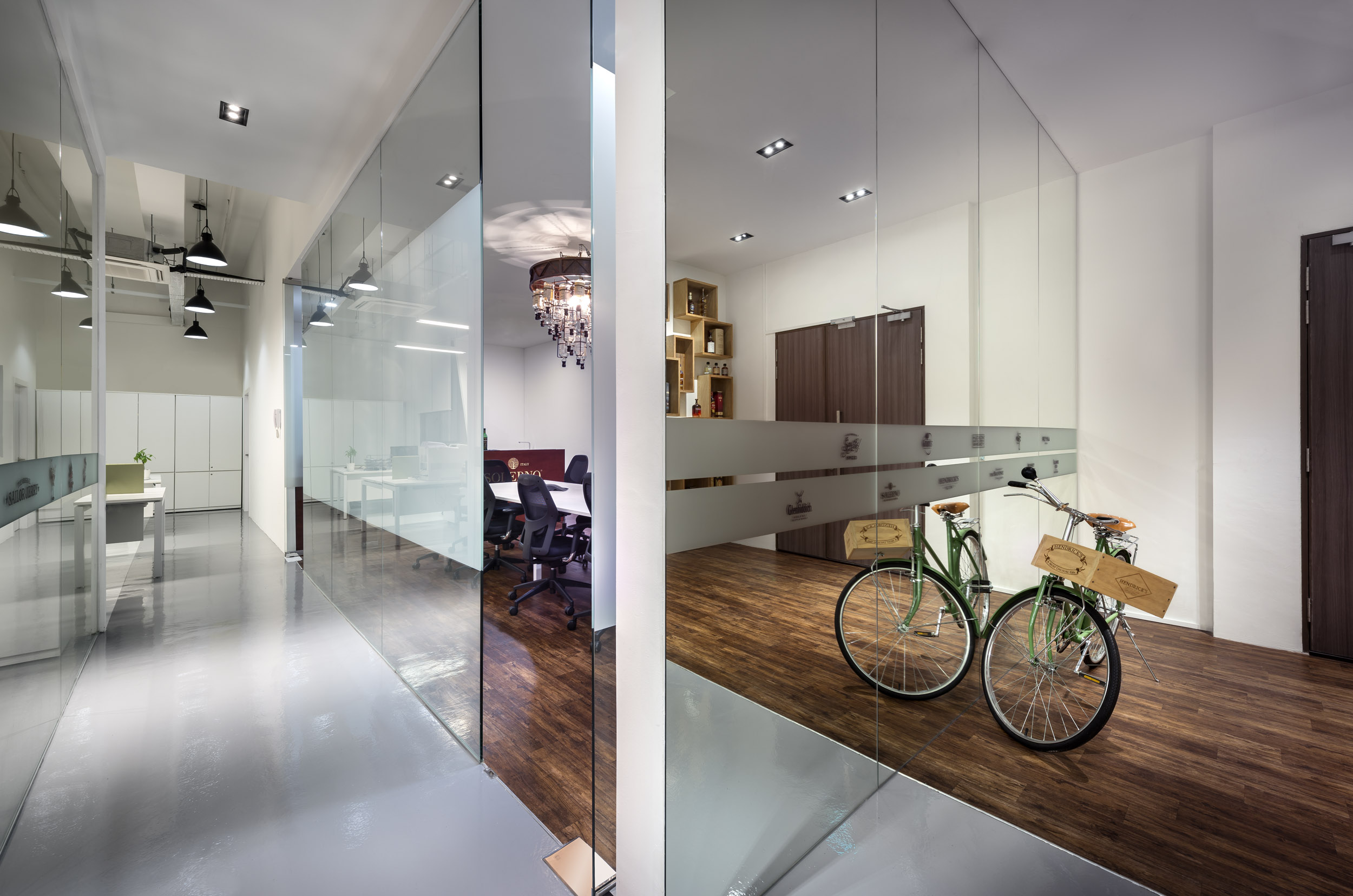
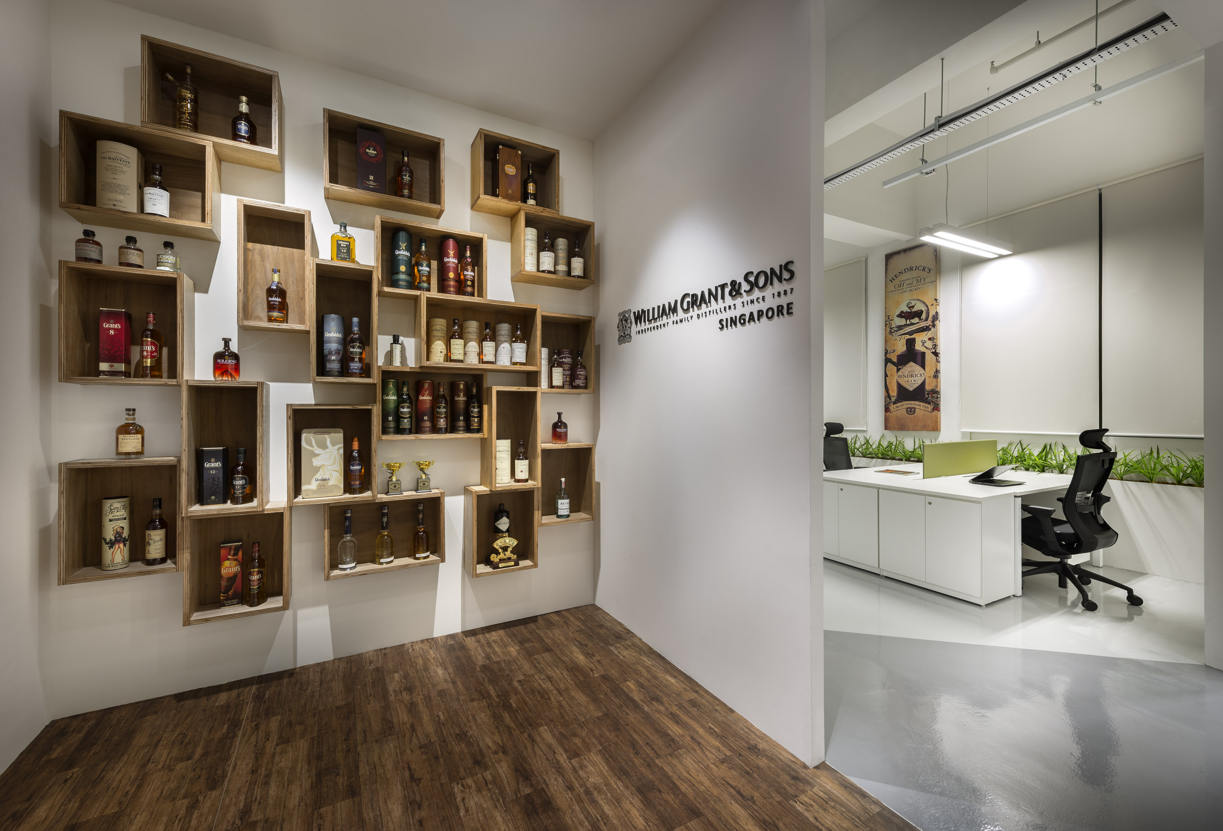
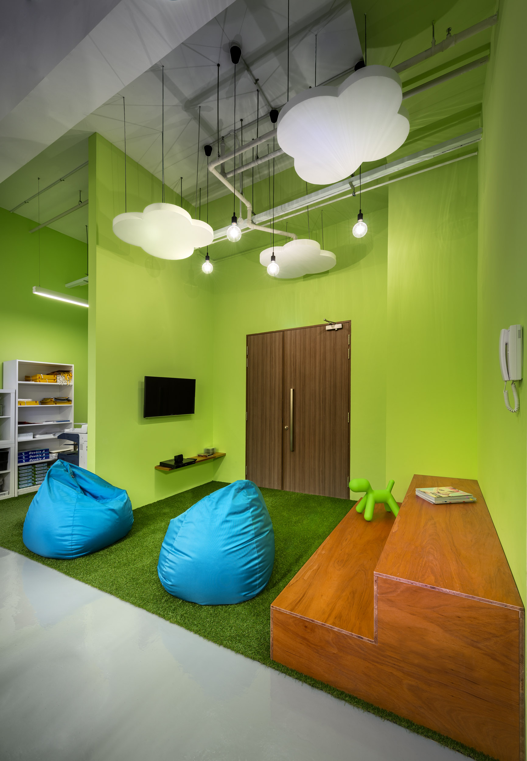
When Scottish distiller William Grant & Sons wanted to redesign their Singapore offices, they called on ADX Architects to reconcile their more than 100-year-old Scotch whiskey brand with a modern, urban workspace. The result is a gleaming open space with playful touches: a lime green breakout room, beanbags, faux grass carpet. The only vaguely enclosed area is the entryway, which frames its bottles in a gallery-like fashion and greets visitors and staff with an unmistakable mix of whiskey warmth and Singapore cool.
We reached out to the team at ADX to find out more.
What is the address of the project?
Kallang Way, Singapore
Who was the interior architect/designer?
ADX Architects
When was the project completed?
2015
What is the total square footage?
3,500 square feet
What were the construction/hard costs per square foot?
$90 per square foot
How many total employees are there and what is the daily population?
50
Tell us about the office’s proximity to public transportation and other amenities.
It’s close to an MRT train station and bus stops.
Which furniture brands/dealers were used?
How is the company’s brand reflected in the space?
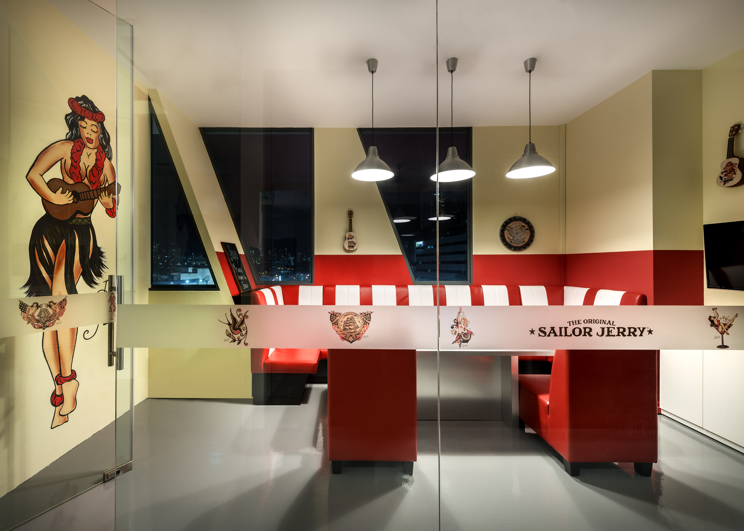
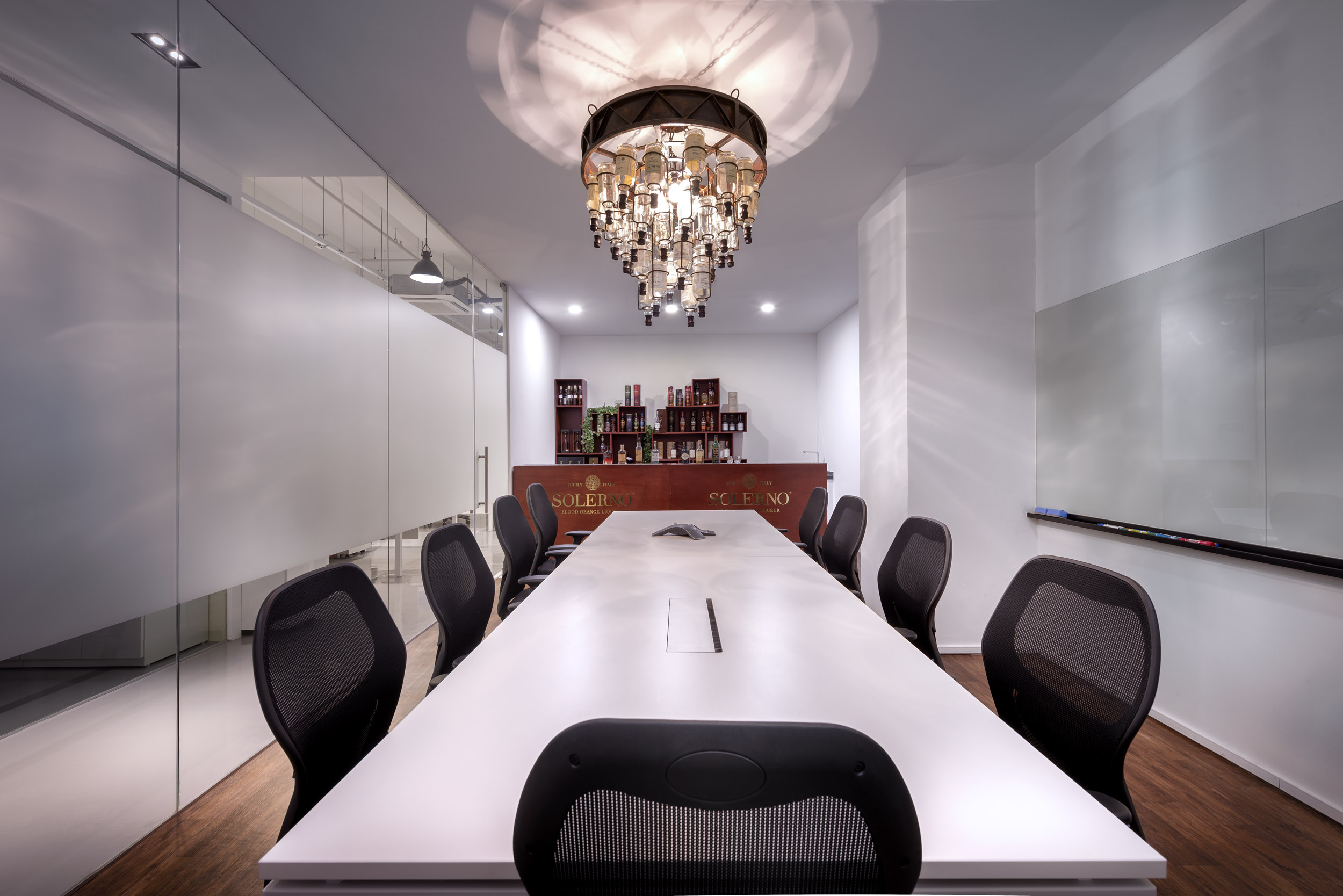
The company’s brand is reflected in the office’s fun, modern, and open design. The main entrance opens to a timber-inspired display shelf that showcases nearly all their bottled spirits. The meeting rooms were also inspired by some of the company’s most famous brands of spirits, such as Sailor Jerry spiced rum, Balvenie whiskey, and Hendrick‘s gin.
What is the most unique feature of the new space?
We used the distinctive and sometimes quirky branding ideas in the design of the meeting rooms. For example, the Hendricks meeting room has walls displaying graphics of its branding, and the furniture and the black velvet curtains all reflect the essence of the brand. The main conference room also has an attached bar that allows for demonstrations. A customized chandelier made of their distinctive Balvenie bottles was created as a center piece of the conference room.
Please share any illuminating, surprising, or hoped-for results you might have gleaned from post-occupancy surveys.
Office staff have shared that the open space feels more social than their previous office with high cubicles and rooms. The fun design and breakout areas also allow more interactions.
Tell us more.
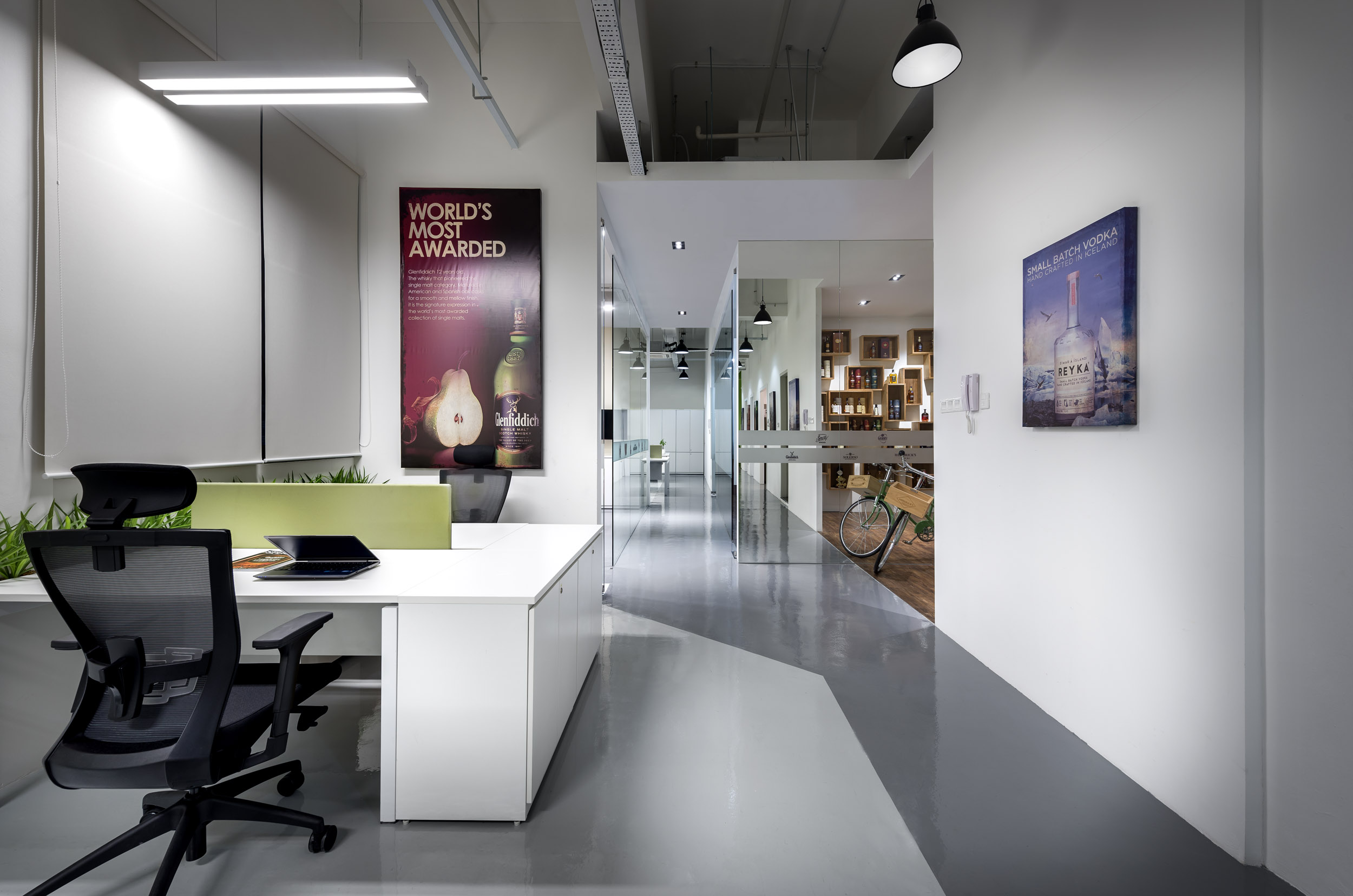
The office space was planned to be as open as possible. There are no high partitions or rooms for senior management. All of the tables have eye-level dividers that still allow staff to interact with each other easily. The main working space is next to the windows along the perimeter. The meeting rooms, pantries, and storage areas were mainly located inside, which allows natural light to illuminate the main office space.
Thanks for sharing more information for us.
Buy an awesome finish from the Signatory Cask Strength collection that arises in a bottle. They are heavy bottles.