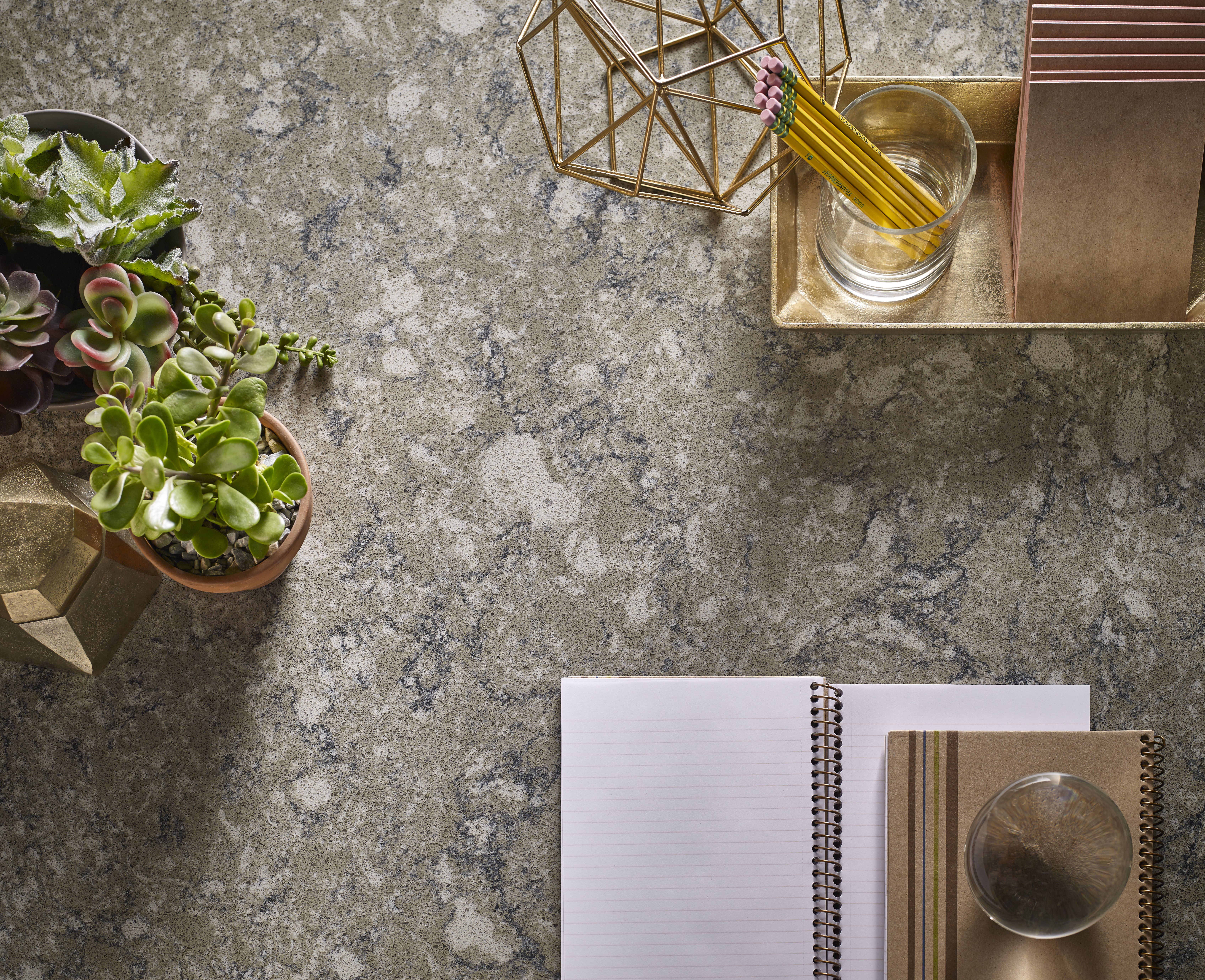
The range of colors in DuPont’s new Corian® and Zodiaq® surface collection is stylish, practical, and perfect for workplace applications.

Crisp whites, refreshing blues, earthy greens, a touch of gray: just reading that is a breath of fresh air. It’s well-documented that colors have a major effect on the inhabitants of any given space, and DuPont took that research to heart when deciding on the colors for their new Corian and Zodiaq surface collections. Along with the new colors, architects and designers can also integrate Corian Charging Surface so that users can charge devices on the fly, without a charging cord or having to crawl around helplessly looking for an outlet.
Can you imagine this in a coworking application? Or simply at your own desk? In lobbies, conference rooms, even bathrooms — what a win.
On top of the high-performance qualities of the surfaces, Corian and Zodiaq also consulted researchers to aid in choosing colors that would have the strongest effect and longest lasting appeal. You can download the full Design Horizon Trend Guide here, and we reached out to Katie Congress, the North America marketing manager for Corian and Zodiaq, to find out more.

Can you share some of the outcomes of the global market research that led Corian to create these new colors?
There is a global trend across segments towards dark blues, veering towards black. Deeper colors are emerging, globally, but their strongest influence has been in blue. It expands the definition of rich and sumptuous from black to this familiar hue. Blue also conveys a sense of trust, which is reflected in the colors.

What is it about the depth of these new colors that you think will be especially resonant in workplace applications?
Six of the new colors were developed using Corian DeepColor™ Technology, which delivers greater depth of lustrous color, improves ease of fabrication and installation, and reduces the scratch appearance by up to 50 percent. The surfaces transform design ideas and inspiration into beautiful reality — all with remarkable durability. From an aesthetic standpoint, they bring a unique direction to blue in hospitality, office, and retail. When pure black is too strong a statement, these dark hues offer an influenced color that is powerful and makes a statement. They have authority and stability, without being too serious.

Were any of the new colors created based on research that shows that certain hues might enhance focus, productivity, or a general feeling of well being for inhabitants of the space?
The whites collection was developed to achieve a purifying, softened look, that fits perfectly in places of wellness. The earth tones collection represent life and growth, which help us reflect the natural world in our environment and instill feelings of calmness. White is always considered a perfect blank space. It is the background one which you can “draw” all of your ideas and let your creativity flow. It helps us bridge ideas and acts as a visual cleanser, as well.

Tell us more about the Corian Charging Surface and how this can be combined with the new colors — we think this could be especially useful in workplace applications and something our readers will be very interested in hearing about!
Corian Charging Surface enables you to charge your phone wirelessly through your countertop. Hidden from view is a transmitter that uses induction technology to power up smartphones, tablets, and more, wirelessly. Energy is transferred safely from below the Corian surface to a smart device, and charging stops when your battery is full. Charging Surface options are available for all Corian and Zodiaq colors. It is a great feature in any [space in an office], including . . . rec rooms and bathrooms. Cut the cord!


