Our industry seemed obsessed with avocado green and hypnotic orange in the 1970s, then deep tones of bourbon red, depressed blue, and hunter green in the 1980s. The 1990s ushered in a glut of bold and multicolored patterns, which were anything but sparse.
The current trend seems to be minimalism — peeling away the layers of color in favor of a more refined look. We have once again found ourselves designing with a single color scheme in mind — or, in what has often been the case in the 2000s, no color scheme at all.
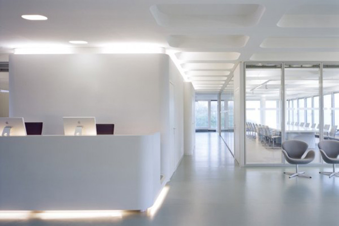
Take a moment to peruse some architectural websites and you’ll likely notice white and opaque materials are in heavy rotation in workplaces today; glass, plastic and concrete cover interior and exterior surfaces to create a monochromatic palette of snowy neutrality.
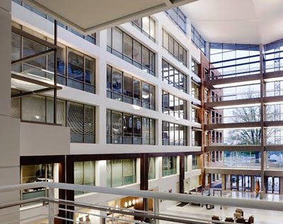
Companies such as KlingStubbins and RTKL, two leading design firms, have taken this 21st century trend to heart; take a look at the headquarters of the Food and Drug Administration, which the firms partnered to design:
Even furniture manufacturers like Herman Miller’s Intent are colorless:
We may well be on the cusp of nodding our heads to Corb, Mies, and our neighbor Hugh Newell Jacobson; increasingly rare are designs that incorporate bright yellows to make us happy and blues to make us feel strong and bold. While the absence of these hues doesn’t reflect who we are as individuals or as a diverse culture, the purposeful lack of color inherently restrains us from fully infusing our personalities into our workspaces.
But does this absence of color reflect less creativity? Maybe the trend toward less color showcases an age where our virtual lives have diluted any sense of animated personalities. Or perhaps it speaks to how well we have been able to master our workspaces, in that cold white concrete is not only functional, but interesting and hospitable.
No matter your stance, an important takeaway point is simply this: color is important. According to the Color Association of the United States, workplace psychoanalysts asked subjects what concepts were most important in describing their environment, and the answers were hue, brightness and saturation of colors, pitch and intensity of sound, and the number of thermal variable. As you see, two of those four relate directly to color.
So, do we really want to spend the time we have on Earth designing workspaces that reflect a monotone aesthetic? Will human beings forget the richness of their once bright surroundings and lose touch with those feelings once associated with rich, saturated hues? If design has no color, will we forget all the textures next and only build with one type of surface?
I say we pitch the all-white, opaque movement and show some personality! Isn’t it time we prove to our design predecessors that we aren’t simply automatons hooked to our computers? We have the power to create interesting, functional, hospitable spaces with the same materials as those who came before us.
Instead of killing off color, we should push the envelope in future projects, challenging ourselves to utilize bold colors and creative concepts.


I so agree and share your color attitude. Color = Energy…. not just conceptually but in real (quantum) physical terms. Why do we see blue, or orange, etc? Because every color of the visible (and invisible) spectrum is actually a measurable wavelength that oscillates at it’s own unique frequency. As an artist, I incorporate color theory on a subliminal level.