The best brands are the ones that come to life and inform a company’s every action and expression. As a brand engagement firm, that’s precisely our goal for our clients: translate brands to any touch-point—internal or external, print or digital, conceptual or concrete.
Offices are no exception. Thanks, in part, to innovators such as Google (and others featured in Workspace Design Magazine), space is now recognized as one of the most powerful vehicles for communicating a brand – and, by extension, building a business.
After all, an office’s design and location can equally affect client and employees’ perceptions.
Moving to new offices this year was an opportunity for our firm to practice what we preach and refresh our own brand. As businesses grow and change, brands need to evolve, too.

For starters, relocating from Madison Avenue to a yet-unoccupied building in the Meatpacking District shifted our company’s identity. As we expanded into new disciplines and more industry verticals, our numbers increased and our perspective widened.
We never stand still. And we’d like to think it was our commitment to moving forward, constantly discovering new ideas, challenging our assumptions, and finding new inspiration that gave us the momentum to grow and the agility to adapt.
So we wanted our new offices to not only embody and convey this spirit, but nurture it. Our space had to be charged with activity, stimuli, curiosity, and camaraderie – because we believe these are the best conditions for creativity.
This goal informed our choice of location and the design system we developed.
LOCATION
New York City’s High Line
We wanted our office to be in dialogue with our neighborhood. After 20 years in Midtown, we saw the Meatpacking District as an epicenter of art, architecture, design, fashion, and gastronomy. Moreover, the neighborhood keeps reinventing itself: its landscape and culture changes almost annually, and we wanted to be part of this community in-motion.
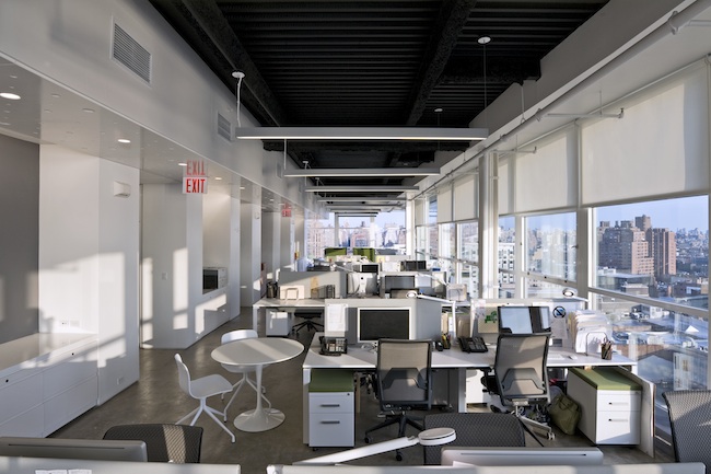
Our location in the High Line building in Manhattan’s lower west side draws energy from the High Line below, but also from the surrounding neighborhood. Thanks to the floor-to-ceiling windows on all four sides, it’s hard to think of our floor as an “inside” space.
As with Philip Johnson’s famous Glass House (New Canaan, CT), the boundaries between interior and exterior blur, and we experience the varying light and changing seasons with unusual closeness.

INTERACTION
Simply put, our space is designed to bring people together. We know that our people are more creative when they interact often, so we wanted to give employees access to each. The layout encourages collaboration and influences serendipitous collisions of people and ideas.
When you put a group of creative thinkers in the same space, the whole is greater than the sum of its parts. By embracing an open floor plan and avoiding walls wherever possible, we were able to amplify the collective talent of our firm. Openness also places everyone on the same plane, elevating each employee’s understanding of his or her contribution.
To encourage interactions, our breakout tables are strategically placed so our disciplines interlace: digital interlocks with design, which overlaps with writing. The broad pin-up niches, which virtually everyone can see, create a different kind of collisional interaction—between people and designs; we want our employees to be inspired by each other’s ideas.
Instead of traditional desks, which can feel isolated and boxed-in, we installed the Steelcase benching system to facilitate mentoring and build camaraderie. Sitting near colleagues of the same discipline promotes sharing—of knowledge, stories, tips, and jokes. As transient as the agency world can be for some, we want our employees to form bonds that go beyond professional civility. When they know each other well and feel comfortable at work, they’ll be able to collaborate more effectively.
Admittedly, good work sometimes requires solitude and focus in a single location. To give our employees places of retreat and concentration, we installed Vitra pods, of which the high, upholstered sides block out most of the din from the open floor.

EXPRESSION
As a creative agency where design is valued and produced, our offices had to have an aesthetic rigor. We aimed for a style, at once professional and human, that would reinforce our forward-thinking brand. Given the building’s modern minimalist look, a contemporary look and feel made sense. Nevertheless, we didn’t want the interior design to compete with the creative work that defines us.
As a result, our design program comprises design elements united by a shared intention to be responsive—at times receding, at other times delighting with unexpected whimsy. The majority of the interior design elements, while expressive of our brand personality, are in service of a purpose or function.

Our surroundings proved inspirational in several design elements. One of the most central elements is our feature ceiling, which, on the most basic level, serves as a way-finding device because it runs over the entire length of the main thoroughfares.
But that’s not all it does: the round dimples in the high-gloss ceiling panels create a sense of movement and effervescence that mimics the pedestrian traffic through the building on the High Line below.
In keeping with the Meatpacking’s spirit of renewal, we built the reception desk out of reclaimed wood to evoke dock pilings in the Hudson and the railroad ties of the old train track. For our accent color throughout the office, we chose a fresh green, which gestures literally to the plant life on the High Line—the park is composed of exclusively indigenous vegetation—as well as to the neighborhood’s emphasis on sustainability and renewal. As a testament to our building’s industrial history, we left the floor and ceiling practically unfinished, even though they were part of the new construction.

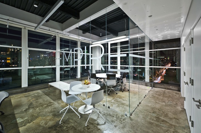
Instead of overt or autonomous signage, we found ways to make the signage intrinsic to the element they identify and at the service of the interaction they facilitate. The semi-transparent lettering for the names of our conference rooms—“Hudson” and “Empire”—becomes part of the vitrine and reinforces the connection to the exterior.

The naming system for our breakout tables and pods is equally subtle, but more whimsical. Silk-screened on the floor under every breakout table is a custom-designed stamp, labeling each table by a different cut of meat (e.g., “brisket,” “sirloin,” “ribeye”).
The pods are identified with what appear to be oversize garment tags that have been stitched onto the furniture; the three tags go from “S” to “M” to “L” according to the size of the pod. Without being prominent, these stamps are still strong and authentic touch-points of our brand and our personality.

Six months after moving into the High Line building—and more importantly, after more than a year of conceiving the design, countless hours of envisioning our agency’s future, and just waiting for the endless punch list to be done—it has become clear to me that relocating Sullivan is not an end point, nor even about office space.
It’s about growing a culture that is forward-looking, whose constant motion and interaction and curiosity keep us imagining and planning what’s next.
Brands, after all, are about the experience customers have with a product, or a company. Anyone who visits Sullivan experiences the culture and way of working which our office space fosters.
And when they witness that in the context of the space’s design, they experience the Sullivan brand.
- Architect/Designer – Joeb Moore & Partners
- Photography – Timothy Schenck


This office looks amazing. This seems to also be the common theme of many software companies in Austin, Tx. It is very expensive to build out an office like this however, one of my clients told me that building out their office similar to this one was one of the best returns on their investment…….in terms of employee recruitment, retention, and productivity.
A company’s workspace really says a lot about it. If it’s small and cramped and the furniture is all worn, it gives off a bad impression. The design of an office should fit the company culture and inspire the employees that spend a majority of their time there.